Movement Voter Project
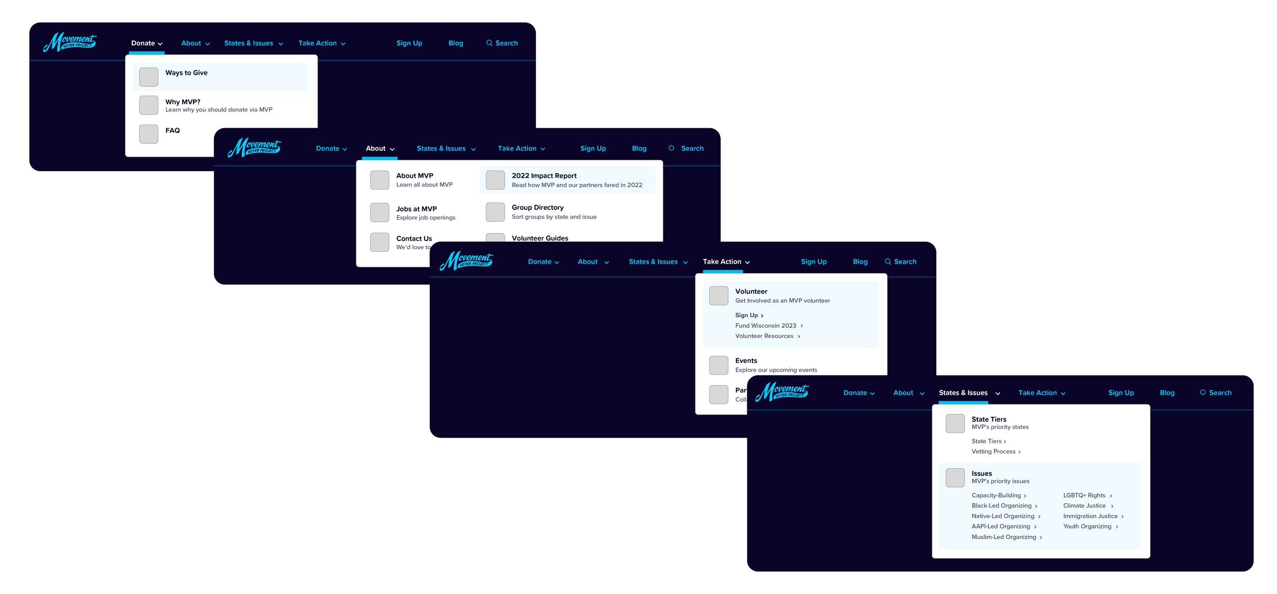
Website Navigation Menu
Info Architecture & UX Design
I designed the Navigation Menu by reviewing and restructuring our website’s information architecture based on user research and best practices. I added Iconography to the menu to help create a frictionless user journey and worked closely with our Product team to ensure design specs were implemented correctly.
Problem
The current site had some confusing user pathways and redundant pages that needed to be consolidated and easier to find. There was no single-action donate button, despite our core audience being current and potential donors. We launched a blog and had begun churning out content that needed more visibility.
Solution
I identified the main user pathways and designed new flows for the site based in user-centric design. To optimize our site for donors I placed a donate button above the fold. I also added a blog button to draw our audience to that content. Since our newsletter frequently featured blog content, I included a Sign Up button for users to sign up for our newsletter too.
Draft Exploration
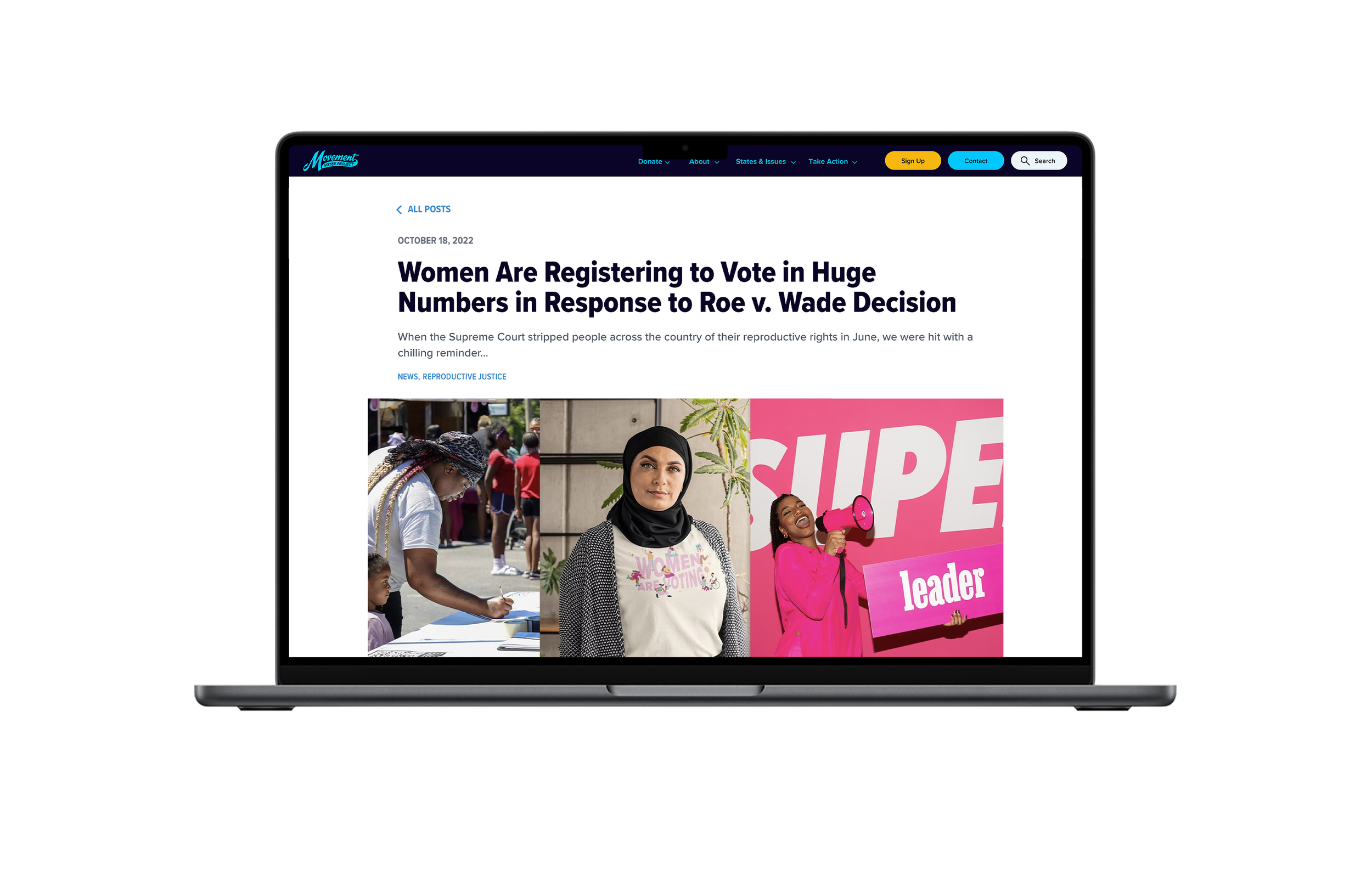
Blog UX Design
Responsive + UX Design
I designed the Blog Homepage and Blog Post pages by conducting a competitive analysis of other organizations with blogs and determining what made sense for our blog. It was important to me that we incorporate a robust tagging system that would allow users to view selected content based on a specific tag.
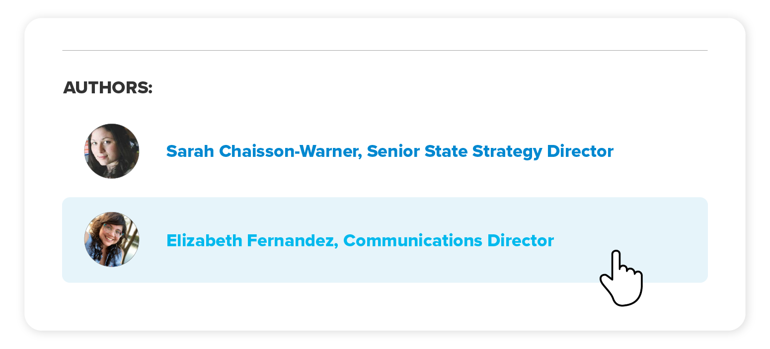
I designed an author section that had the ability to link to existing bios and added a section for “More Posts” after each post. I also performed WCAG accessibility checks and adjusted our type contrasts accordingly.


